We loved this his conversation about the color white so much we had to repost it in it’s entirety, reprinted with permission from our friends at North Creek Nurseries.
A Conversation About the Color White with Native Plants in the Garden
If you go to the paint section of your local hardware store, you’ll see that white is not simple white. The “white” paint color section may have the most shades available of any color. From warm tones to cool values, white is not basic – it’s a complex color that is tricky to get right.
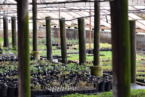
In every garden design, there are outside influences that provide context, whether conscious or not, to the design scheme. There’s nothing quite so innocent as when you set out to make a white garden, ala the infamous Sissinghurst white garden, and find out what starts out seemingly simple is actually difficult to pull off. Having a refined palette of white blooming plants offset by soothing shades of green requires more legwork than originally anticipated. Eight years ago, those of us in the trial garden department naively stumbled along this very “white native plant garden” journey, and there’s been some learnin’ along the way.
The Problem
White is not white. What most frequently occurs when planning a white garden is the tendency for the whites of the flowers to appear “muddy”. Instead of the greens and other white flowers singing together, it looks messy and frumpy. Have you experienced this? Why does this happen? Well, this is what we picked up along the way.
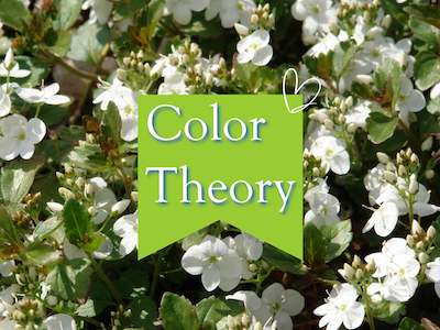
Color Theory
To put it candidly, color theory is a fancy term for how colors work together and how they affect our emotions and perceptions. Color doesn’t exist independently, by itself. How our eyes read color and how it affects us depends on the context, everything from the quality of the light to how color harmonizes or contrasts with other colors, to social constructs and views around color. Color theory is seen as a subjective and artistic vein while color science is more objective, quantifiable, and has functional applications in chemistry and astronomy. When we’re getting into color in garden designs, we’re walking the artistic pathway.
If you’re someone who attended art school or know someone who has, you’ll know that this is an area of study that we’re blithely racing past. But we’ll keep it simple. Colors are more than just what shade they are – there are other qualifying descriptors that allow you to best understand the true perception of this light wavelength.
Hue: The color family or wavelength range of a color, such as red, green, or blue. Hue is the purest form of a color, like a primary color.
Saturation (chroma): The intensity, purity, or saturation of a color. Colors with high chroma are pure hues, while colors with low chroma have more gray in them.
Value: The lightness or darkness of a color, determined by adding white or black.
Tone: A color made duller by mixing gray
Shade: A color made darker by mixing black
Tint: A color made lighter by mixing white
Now that we have all these terms out of the way – let’s get into the real question at the bottom of this. When you’re employing white in a garden design, hoping to make either a crisp and cool white garden, an elegant white garden, or trying to brighten up a shady corner – why isn’t it working??
“Muddy” whites
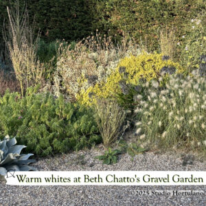
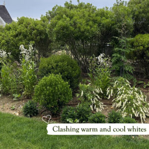
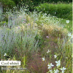
“Muddy” whites are whites that lack purity in the hue. They are touched with tints of other colors in the flower, especially yellows or browns. “Clear” whites are whites that usually have a touch of cool colors influencing their visual reception, made more intense in chroma. Whites that veer towards cool pinks, purples, or blues can be seen as closer to a “clear” white. White flowers with warm shades tinting the color like those of yellow, brown or orange warm up the perception of the white coloring. Whites touched with warmer shades are said to be “muddy” when contrasted to cool-colored whites. Let’s be clear, warm white isn’t a bad color! However, warm whites are jarring when next to cool whites. It’s like getting white LED Christmas tree lights. Each company makes them slightly different in color and when strung together, you can really see which white Christmas tree lights look cool or look warm in color. When different shades of white Christmas lights are mixed, it is discordant. Keeping everything in the same family is how you can make different things come together harmoniously.
Experience with a plant will help you select which white flowers are “clear” and which are “muddy”. It’s hard to convey the shades of color by words or even photographs because there are so many factors that determine how a shade will be perceived, including the age of the flower. It’s important to note that most white flowers will age brown, which will also influence how they are perceived. Careful selection of plants and the right cultivars goes a long way to transforming a “white garden” into something that soothes or excites without making it look messy.

Outside Influences
Background
The back drop to the planting can help amplify or muddy the colors and it’s important to consider the background in the overall context of the planting design. The context of where the plants are planted, what’s around it or in front of it, can deepen the coloring or wash it out. It’s important to consider what the white garden is sitting in when you’re determining whether or not you’re going for cool whites or warm whites in the garden design.
If you have…
warm white siding, warm grey siding, taupe or brown siding, brown stonework, brick, natural wood, red-tinged or olive-green evergreens…
Use WARM white coloring in flowers and foliage
Examples of warm white flowers:
Achillea millefolium | common yarrow
Asclepias incarnata ‘Ice Ballet’ | swamp milkweed
Asclepias verticillata | whorled milkweed
Aster divaricatus | white wood aster
Aster ericoides ‘Snow Flurry‘ | white wood aster
Asteromea mongolica | Japanese aster
Boltonia asteroides | false chamomile
Clematis virginiana | old man’s beard
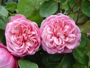
Echinacea purpurea PowWow® White | coneflower
Echinacea purpurea ‘White Swan’ | coneflower
Eupatorium perfoliatum | common boneset
Kalimeris integrifolia ‘Daisy Mae’ | Japanese aster
Leucanthemum × superbum | shasta daisy
Monarda punctata | spotted beebalm
Scutellaria incana ‘Prairie Snow’ | hoary skullcap
If you have…
Crisp white fencing or siding, cool grey siding, concrete, navy or black tinted wood or siding, aged silver cedar siding, grey or black stonework, blue or silver evergreens, dark green evergreens…
Use COOL white coloring in flowers and foliage
Examples of cool white flowers:
Antennaria plantaginifolia | pussy toes
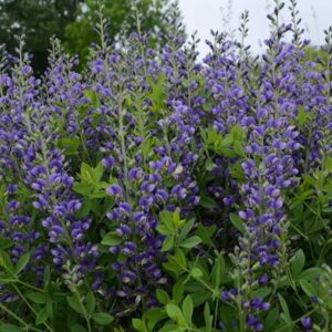
Baptisia alba var. macrophylla | white false indigo
Calamintha nepeta ssp. glandulosa ‘White Cloud’ | calamint
Erigeron pulchellus var. pulchellus ‘Lynnhaven Carpet’ | fleabane
Eryngium yuccifolium | rattlesnake master
Oenothera speciosa | pink evening primrose
Penstemon digitalis | beardtongue
Pycnanthemum | mountainmint
Physostegia virginiana ‘Miss Manners’ | obedient plant
Veronicastrum virginicum | Culver’s root
Colors pop against dark backgrounds, amplifying the tones, and can neutralize the “noise” of some other colored backgrounds. While the high contrast look of light flowers and dark background can be quite modern, it does bring color choices into sharp relief and will strongly show when colors are not in the right family of tones or shades. Against cool shaded backgrounds, knit shades of white together using plants with blue, grey, or silver foliage as well as greens. In warm colored backgrounds, select olive or yellow-green foliage, including chartreuse, to bridge the color families between white flowers and foliage.
Quality of Light
While we were embarking on a white garden years ago at North Creek, a garden designer pointed out that a white garden in Philadelphia is going to look a lot different than the Sissinghurst White Garden just because of our latitude and quality of light. Locations closer to the poles receive gentler light than regions nearer to the equator. The intensity of the light- the angle it hits the surface of our planet, the duration of time it’s at its full force, determines the “quality” of the light. Photographers define quality of the light as the size of the light source relative to the subject. While we may not consider Philadelphia close to the equator, we have stronger, more intense light due to the angle of the sunlight that hits our patch of earth than the famous Sissinghurst garden, meaning our whites wash out in the heat of the day. Harsh light is defined by its ability to throw well-defined and dark shadows with a high degree of contrast. Soft light is characterized by low contrast and soft, undefined shadows. As everything in life, one thing isn’t necessarily better than another, it’s just different. Despite the name, harsh light isn’t inherently bad or good. It’s what you do with it. Designing a garden for the kind of light received showcases the skill of a garden designer who understands the site and is working to compliment it versus fight against it. For gardens in harsh, direct light, revel in the dramatic contrast and emphasize the character and texture of the plants. Select for sculptural plants and restrained plant palettes with plenty of negative space so shadows can fall on flat surfaces (see modern desert gardening). In garden sites with diffuse light, either dappled by an overhead tree or the planting area receives light when in the morning or late afternoon, choose shaded or tinted hues and textured forms because the eye can read subtlety and variation in softer light better than strong light.
Reflecting on White
The challenge with making a successful white garden is you suddenly have to contend with the more esoteric parts of garden design. Whereas a collectors garden prioritizes the rare over the aesthetic and the natural garden prioritizes diversity and ecosystem services over design theory – the second you veer into color means you are wading deep into observed principals reflecting social values honed over time. How we appraise color and the beliefs we project onto a wavelength of the visual spectrum depends entirely on the society, the context, and the people who perceive it. When you restrict the palette to one color, you’re now forced to grapple with form, hue, space, repetition and rhythm, context, and light.
When we set out to make a simple white native plant garden nearly eight years ago, we didn’t expect to fail so spectacularly. We thought it would be as simple as throwing some plants together with white flowers that liked the same soil and light conditions and bloomed at different times. What we got was a muddy, frumpy, confusing travesty of a corner garden. It’s taken some years of careful observation of our native plants, recognizing their forms, growth patterns, and true colors to realize where we went wrong. In time, we redesigned that corner garden for another purpose and moved on from that project. The white garden project was helpful to hone our eyes so we can make better recommendations for our customers. Lesson learned.